Use the layout editor
Who can do this:
- Anyone with editing permission for the Homescreen and HS Sections, if editing existing sections and creating Display tags
- Additional viewing permissions are needed for any content you want to place in the layout
The layout editor (also called the app preview) is the interface where you can design the structure of the homescreen and select what content and features are included, and where.
Access the layout editor by opening the desktop version of a layout.
If you have a single layout:
- In the top-right corner of the dashboard, select the Desktop icon.
If you have multiple layouts:
- Go to Admin ➤ Structure & Settings.
- Under Groups, select the Group of the layout you're editing. If a Team, select the Group first, then the Team. Your organization may have other labels for these.
- On the page, under Settings, select the Edit layout button.
- This loads the layout and a dialog appears notifying you which layout you're editing.
In the dialog, click Ok.
- In the top-right corner of the dashboard, select the Desktop icon.
This opens the desktop version of your layout for the Group or Team you selected.
Take a look at how to use the editor, below.
The layout editor gives you the tools to edit or create layouts, as outlined below.
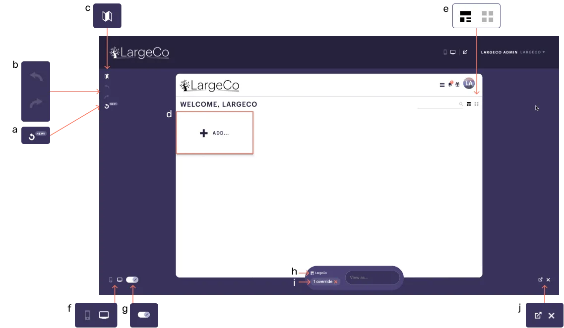
a. Layout history: Click to view past revisions and revert if needed. Content changes (e.g., tagging, untagging, and block edits) are not recorded.
b. Undo/redo: Use the back arrow to undo or the forward arrow to redo an action that changes the layout. This does not apply to Content blocks.
c. Map: Select this to view the layout's structure, which appears in the left pane. You can navigate to a section or block within the layout by clicking on it in the Map.
d. Add: Select this to add a Section, Feature, or Menu. The option to add a Content block appears once a section has been added, with the Include content option enabled.
e. Grid: Select a grid template to use for a new or existing layout.
f. Mobile/desktop: Select the mobile or desktop icon to see that version of the layout. For more on this, see Mobile vs desktop layout.
g. Display switch: Toggle this on to view the ready-only, published view.
h. Group & user info: This displays the name of the Group layout you're viewing and who you're viewing it as. You can:
- Enter a different user or Group name, to view it as someone else.
- Click the Group name to open the Structure page and change layouts.
i. Overrides: This shows the number of sets you have selected. To view the layout without variations in Sections, click the x to reset the layout.
j. Open full view/close: Select the arrow to open the homescreen in a new tab in your browser, in full desktop view. Select x to close the editor.
When you select the Map icon, the Map appears in the left pane of the editor, automatically showing the layout structure. Click on a section or block in the Map to navigate to it.
In the example below, selecting Discounts in the Map, opens the menu (in this case, within a sub-layout).
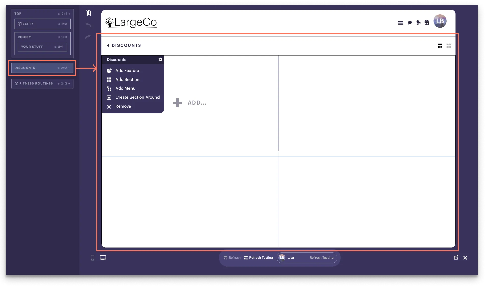
Each section or block has a small menu that appears when hovering your mouse over the top-left corner (for Sections) or top-right corner (for blocks). You can also access these menus through the Map.
Select a tab, Section menus or Block menus, to see the locations for each.
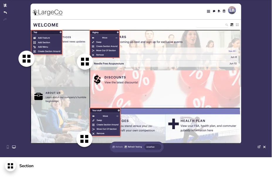
Sections and blocks have the following menu options:
- Gear icon: This opens the setup window for the block or Section, where you can make changes.
- Move: This allows you to move the item to the right or left.
- Swap: This lets you switch the positions of two items.
- Remove: This removes the item from the layout.
- Edit: This allows you to make changes to the original piece of content.
- Untag: This removes the Display tag from the content item, so it doesn't appear in the layout.
- Disable: This expires the content, so it is removed from the layout. It is no longer an option to include in the layout until it is re-enabled.
Sections have a few other options that blocks don't have, including:
- Create another Section around it
- Move it out of the Section
- Add a Content, Feature, Menu, or Sections
If you've added Sets to a Section, you'll see a tab for each, in the lower part of the Section, shown below.
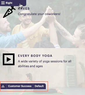
Click a tab to see the version of the Section for that Set and then edit the blocks as needed. Refer to Add & manage Sets for more details.
The content chooser allows you to place existing content in the layout. Within each content type, items are listed newest first. If you have more than 50 items, navigation arrows let you to browse through each page.
Key info is indicated below.
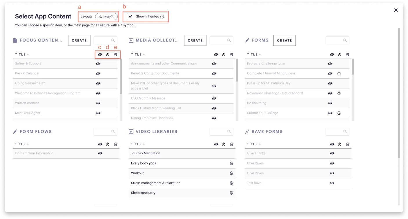
a. Hierarchy symbol: This is the layout you're adding content for.
b. Show inherited: Tick this checkbox to access content created above your admin level.
c. Visibility (eye) symbol: Indicates the item won't be visible in the app to you because you're previewing the app as a user who doesn't match the item's availability. To see it, in the View window, below the app preview, enter a user’s name to whom it's been made available.
d. Time symbol: Indicates the item won't be visible in the app because the item is scheduled to appear at a future date or has already expired.
e. Global symbol: Signifies the item comes from a higher admin level or is global content, so it’s managed outside your current admin access but is still available across different levels.
Where else can I find the content chooser?
The content chooser also appears when you select Include link? and In-App for posts, like News & Notices or Focus Content.
