Common settings
Who can do this:
- Anyone with editing permissions for Homescreen and the relevant content, whether Forms, Messages, Challenges, Rewards, etc.
These settings are common to most content you create in the dashboard, except where otherwise noted:
- Menu appearance, to set the image, icon, title, and summary
- Display tags, to place content within the layout
- Preview, to see how it will look in the app
- Scheduling, to set when when and how long it's visible
- Availability, to choose who it is visible to
Menu appearance
Customize what appears on the homescreen by filling in the fields below. Users can view and click the menu on the homescreen to access the full content.
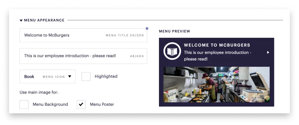
- Menu title: This is auto-filled with the title of your content, which you can edit. It's recommended to stay under 40 characters to ensure your text fits, but the limit is 200.
- Menu text: Enter a brief introduction, which appears below the menu title. It's a good idea to stay under 100 characters to ensure your text fits, but the limit is 400.
- Menu icon: Select a small graphic from the dropdown. The icon appears to the left of the menu title.
- Highlighted: Select this to make your item stand out by appearing in a different color.
- Use main image: Select this to use the image you uploaded with your content. Choose how it's displayed: poster, background, or both.
- Menu image: Use a high-resolution, landscape-oriented image in JPG or PNG format (ideally 16:9 or 4:3).
Why does my image look cut off in the menu?
Menu images work best in landscape format (ideally 16:9 or 4:3). Vertical images may be cropped on mobile, so for full display, use them inside a Media Collection or Focus Content instead.
Display tags
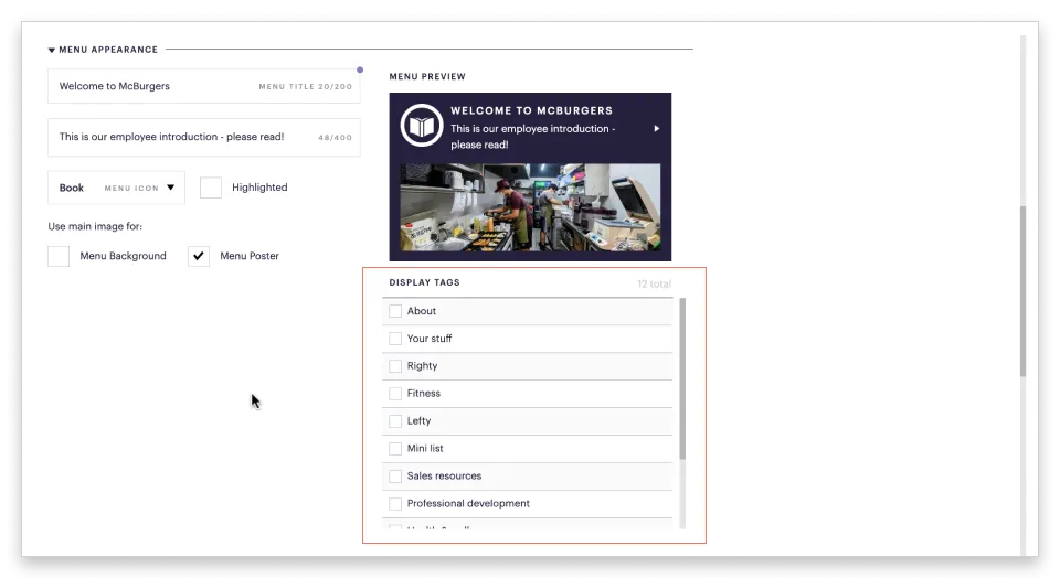
Display tags are used to place various types of content within a section of the layout:
- Focus Content
- Forms
- Media
- Sequences
- Rave forms
- Marketplaces
Select one or more Display tags to place the content within a section of the layout. Learn more at Add blocks to your layout.
Previews
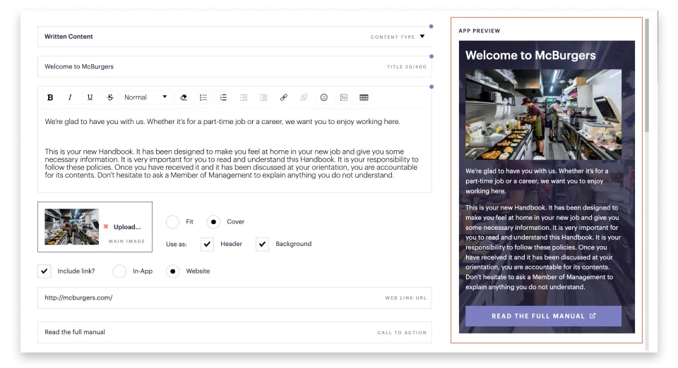
As you create your content, you'll see a preview on the right of how it will look in the app. Focus Content and Media Collections have both the App and Menu preview, whereas the other types of content have only the App preview.
Menu preview: On the right of the Menu Appearance fields, you'll see how the menu will look on the homescreen.
App preview: This shows how your item appears after users go to your content.
Scheduling
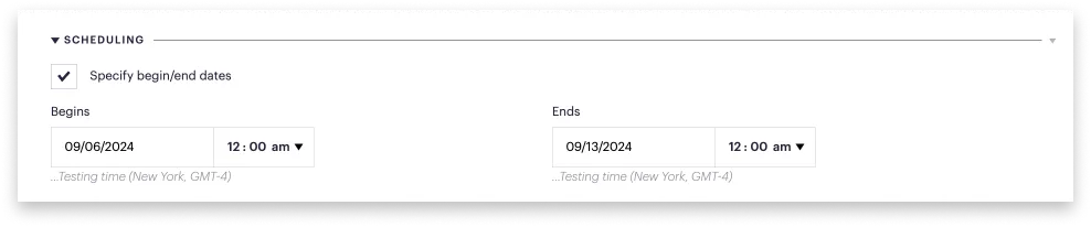
Specify begin/end dates for when your content will be published and expire. Selecting dates allows you to present content in a variety of ways:
- Schedule content in advance of when you want it to be published.
- Create a series of overlapping content pieces.
- Make content permanently available by choosing an end date far in the future.
If no dates are selected, your content will be immediately published.
Availability
Groups
Select the Group or Team (sub-group) you want the content to be visible to:
- If no Group is selected, the content can be viewed by everyone.
- If you select a Group, the content can only be viewed by users in those groups.
User Tags
Select a User tag if you want the content to be visible to users with that tag. User tags are optional and useful for assigning content for a temporary special project or event.
If both a user tag and a group are selected, the content can be viewed by everyone in the Group, plus everyone with those user tags.
How do I set up a user tag?
Before you can select a user tag, you need to have created the tag and assigned it to users. For more details, see Add user tags.