Style sections
Who can do this:
- Anyone with editing permissions for the Homescreen and HS sections
Customize a section’s appearance to visually break up your layout.
Style the background
Set the tone for each section by applying a background color or leaving it clear to create white space.
To style the background:
- Select the Style tab.
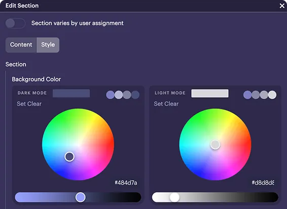
- Under Background color, select a color for both Dark mode and Light mode:
- Light mode: The section appears on a white background.
- Click the color picker to select a shade, or paste a hex code into the bottom-right field.
Enable a "Floating" style
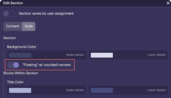
Give your section a bubble-like appearance with spacing and rounded corners. For consistent margins, apply this to a nested section, not an outer section.
How can I make the most of the floating style?
Use it sparingly to highlight interactive content like Challenges or Events and draw users' attention, without cluttering the screen.
To enable a floating style:
- In the Style tab, scroll to "Floating" w/ rounded corners.
Style the header
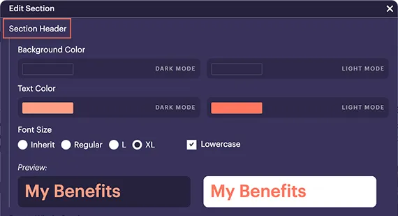
Adjust the header background, text color, and font size.
How do I add a header if I don't see one?
If your section doesn’t have a header, go to the Content tab and toggle on Header + Title. For more details, see Add & edit sections.
To style the header:
- In the Style tab, scroll to Section header.
- Under Section header, adjust the following:
- Background color: Applies only to the header. You can match it to the section background for a cohesive look, or choose a different color to make it stand out.
- Text color: Choose the header’s font color. For consistency, you may want to use the same text color as other sections across your layout.
- Font size: Select from Inherit (matches the outer section), Regular, L (Large), XL (Extra large), or Lowercase.
- Use the Preview to check readability and then save.
Your changes are immediately applied.
How do I use bold colors without overhelming the screen?
Try using just one bold background color per screen to highlight high-priority content like News & Notices. For the rest, consider softer tones that complement your layout without competing for attention.