Add & edit sections
Who can do this:
- Anyone with editing permissions for the Homescreen and HS sections
- Additionally, the Tags (editable) permission is required to rename or delete tags
Add a new section or make changes to an existing one.
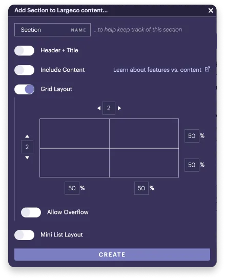
Add a section
Add sections to organize content in your app's layout. You'll work from left to right, top to bottom, in the desktop view.
To add a section:
- In an empty slot, click + Add, and choose Section.
- The settings window opens.
- Keep the Content tab selected and choose your settings, explained in more detail below.
- Click Create.
Edit a section
Modify a section to enable or disable content, add a header, or make more room in the layout.
To edit a section:
- In the top-right corner menu of the Section, click the Gear icon.
- The settings window opens.
- If Section varies by assignment is enabled, first select the tab for the Group or Tag you want to edit.
- Keep the Content tab selected, and choose your settings, explained in more detail below.
- Click Save.
Why can't I select the Grid layout option in the mobile view?
The Grid layout option can only be accessed while in the desktop view.
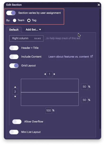
Section varies by user assignment
Enable this option if you want to tailor a section for specific users, based on their assignment, whether Group, Team or Tag. For more details, see Vary sections by user assignment.
How do display tags work when creating sets?
When creating multiple sets of a section, each one needs its own unique display tag. This ensures the correct content shows for each set. Learn more: Use display tags to place content.
Name
Enter a name to keep track of the section (e.g., Left column). This is only visible to you in the layout editor.
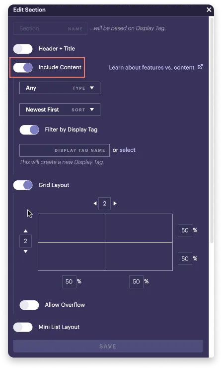
Include content
By default, all sections can contain feature blocks, menu blocks, and sections.
Enable Include content when you also want to place Content within a section. This gives you additional options for placing and sorting content items.
Grid layout
By default, a new section has the Grid layout enabled and a two-by-two grid, which you can change. Add rows and columns, and adjust their width and height as you wish.
In the example below, the grid for the nested section, called Righty, has three rows or slots.
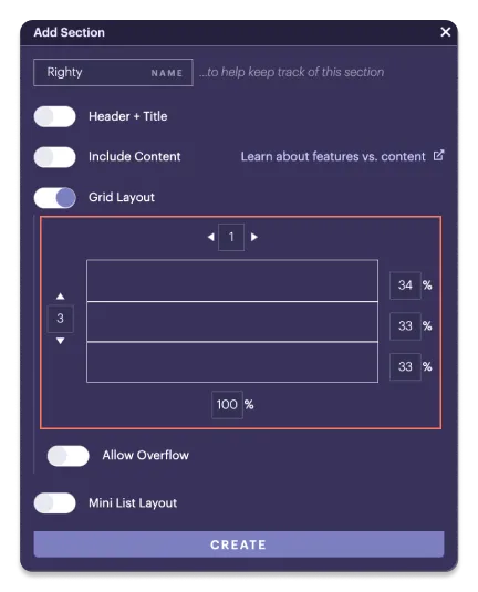
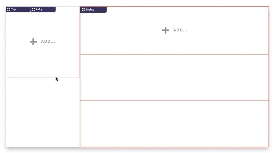
The grid affects how many slots are available to place blocks and sections, since one block (whether content, feature, or menu) or section can be placed per slot. If you nest a section within a slot, you can set up another grid layout with additional slots.
Mini list layout
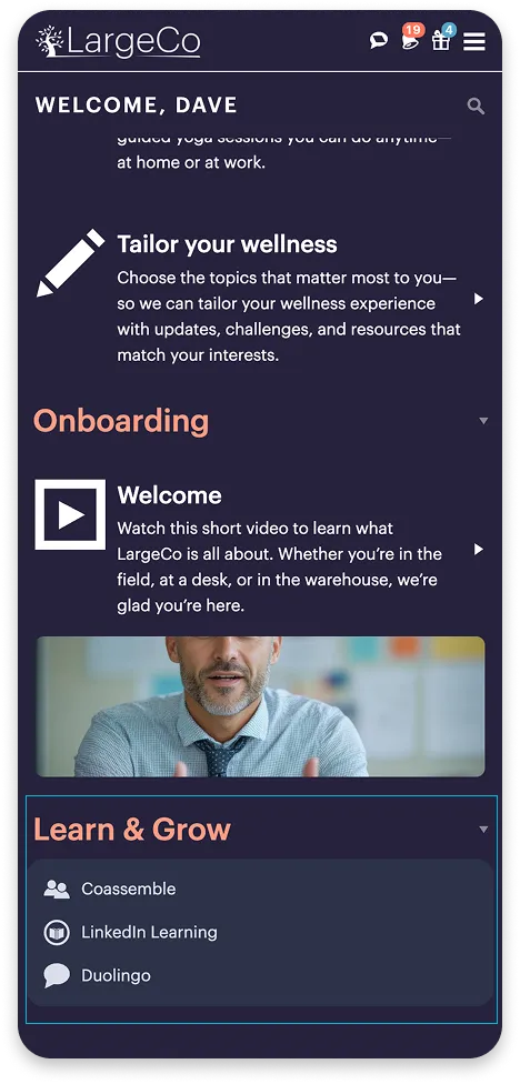
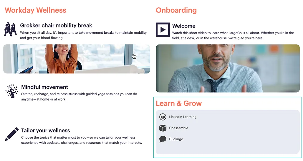
The Mini list layout is an alternative to the Grid layout. Since it does not have a grid setup, blocks you add appear as a list, which users can scroll through. This is useful if you have a number of items you want to include in a section.
In the example below, the Learn & Grow section has a Mini list layout.
Header + Title
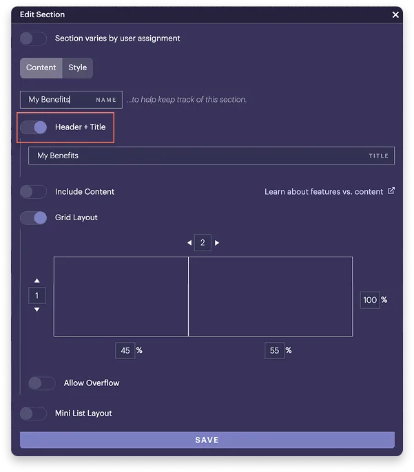
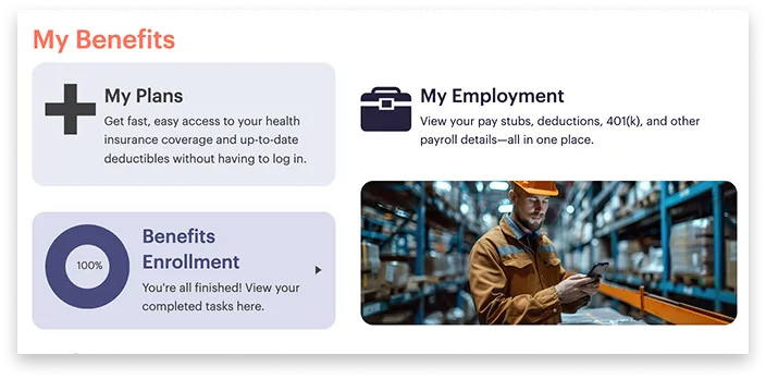
Enable Header + Title if you'd like your section to display a title across the top. You can style it with a colored header behind the title (like a banner) and adjust the the text's size and color. To learn how to do this, see Style sections.
In the example below, the section includes a title labeled My benefits.
How is the Header + Title different from the Name?
The Name helps you keep track of sections in the layout and it's only visible to you. If Include content is enabled, by default, the Name is automatically set, based on the Display tag you set. Meanwhile, the Header + Title are what users see within the app.
Allow overflow
Allow overflow is an advanced option that allows for additional posts you create to appear in new rows below the section.
This is not recommended since it extends the layout beyond one screen in the desktop view, and you'll end up with too many items. Refer to the recommended approach for building the layout.